What Pixel Size Should I Use for My Website Header?
Jaime Escott - 3 Min Read

What Pixel Size Should I Use for My Website Header?
As a front-end developer, I receive many questions about how images should be formatted before being uploaded to a website, especially those being used as backgrounds, such as hero or full-width components. The most common question I hear is “what pixel size should I use?”
While it is great to hear that people are thinking about how images should be formatted, the answer to this question is rarely simple. One of the most challenging things about building websites today is that we have to make sure the user experience is equally as effective on every device and screen size, whether it be a phone that fits in your pocket, a laptop, or a much larger retina display. We have to take into account that even if one computer screen is physically the same size as someone else’s, their screen resolution could be different, which makes the same layout look very different for them.
The Difference Dilemma
Take these screenshots for example. Both were taken on the same 13-inch Macbook Pro screen. The first image is using the standard display with a resolution of 1280x800 pixels. The second image is this same computer with the retina setting displaying at 1440x900 pixels.
Notice how the second image shows much more of the person sitting in the chair, while the first one crops at his leg. Even though both are being viewed on the same size laptop, the users aren’t seeing exactly the same thing.
Now take into consideration how many smartphones, tablets, and various styles of computers there are out there, and suddenly we have an infinite amount of screen sizes. It’s no wonder why we can’t think in pixels anymore!
Decorative Elements vs. Defined Content
First of all, many times these images that are being styled in a specific way are used as decorative images, rather than content.
For example, a common use of decorative images is in the hero of a web page. These images are included in a page as a design element, not content, so images that have an important defined subject should not be used in these cases. Instead, images that are still relevant even if cropped should be used.
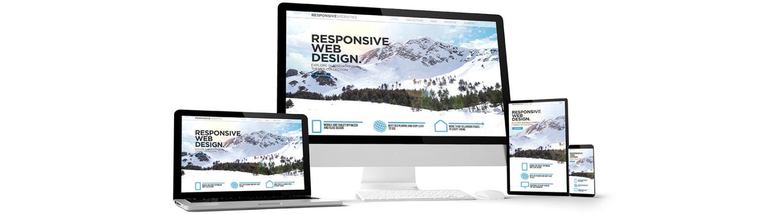
Take this hero image for example: It is cropped differently on a desktop view vs. a mobile view, but because it’s intended as a decorative element, not as defined content, it still works.
Any image that includes critical content should be added like the images of this blog post, where the content editor has full control of how and where the image is displayed, rather than as a decorative element of the page.
So, What Should You Do?
When considering images for decorative aspects of your website, focus less on the ‘pixel-perfect’ concept, and embrace the fluidity! Choose images that are visually interesting in different ways, and feel free to test them out on your website to see how they look across different devices.
While, as developers, we are constantly finding new tools to help make these displays more predictable, the sheer number of screen sizes available makes it critical to plan ahead and test to ensure perfect imagery formatting.